Mimo is a learn-to-code app for web development, with programming languages for HTML, CSS, JavaScript, and many more for Pro members, with in-depth courses regarding these topics.
Boasting over 6.8k ratings with a total star count of 4.8/5 stars on the iOS app store, as well as a whopping 135,000+ ratings with a 4.7/5 stars rating on the Google Play Store, alongside the Editors’ Choice badge on the Google Play Store, the Mimo app was my personal go-to when I was interested in HTML.
For this review, I mainly focused on learning HTML. This review was also done on the free version of Mimo, hence, Pro/Paid features won’t be tested. (Though, if there is enough demand for the Pro version review, I’ll be sure to update this review after buying the Pro version)
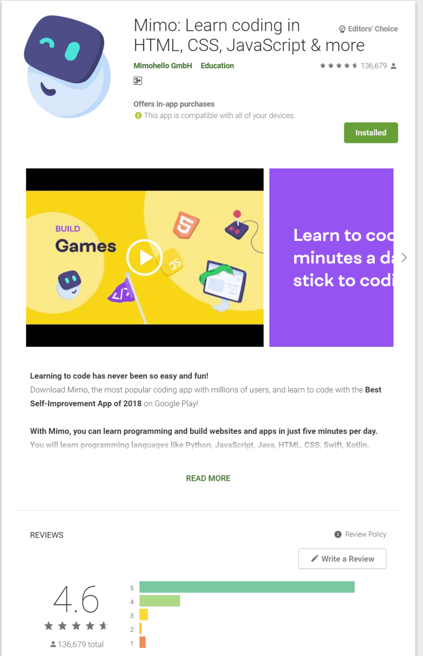
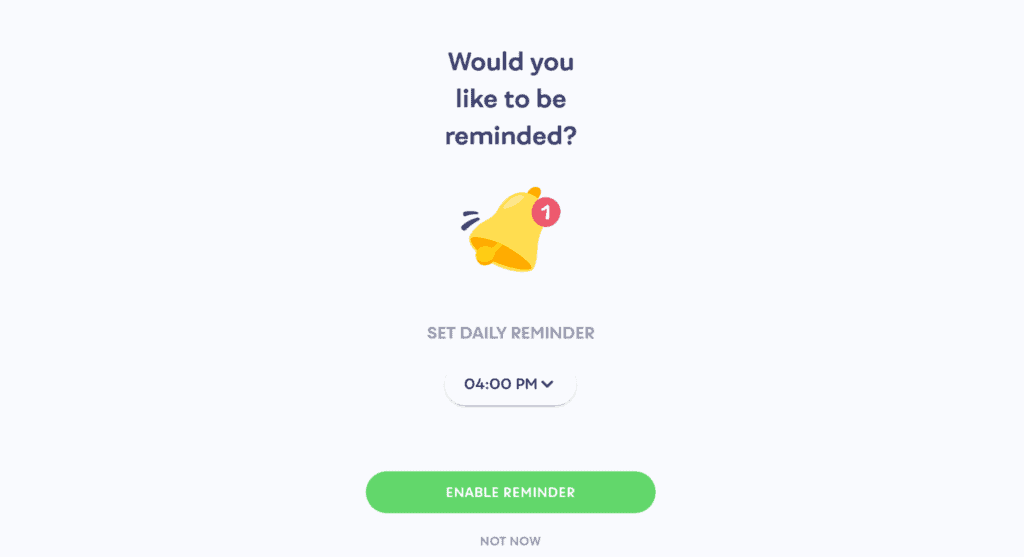
The Mimo app is heavily centered around having coding be part of your daily schedule; as seen in the app store description, as well as when you sign up, where you’re asked to set reminders, as well as how long you wish to spend coding every day.
I previously installed the app to try out coding HTML and left when I finished all the HTML courses, and didn’t stay for the other courses on the app, because I had lost interest in coding over time and the fact that I had to pay for the Pro version to do projects, and challenges as well as to view the glossary wasn’t helping. But I totally understand that the developers worked hard on the app, and require for the operational costs to be paid off.
Mimo Review
When testing the app this time round, I made a brand new account to view it from the perspective of a total beginner, as well as to freshen my mind of the first impressions of the Mimo app. And I can honestly say that I’m more than impressed with the design of the app.
The main difference between Mimo and other coding apps is that it is less about building a community, and instead more about building a daily routine. (You can view other profiles by going to the leaderboards, but, that’s about it.)
Daily streaks and leaderboard standings are what the devs push, and I do prefer this method of motivating the user to code!

Before signing up for the app, you’ll be prompted to enter in your purpose for wanting to code, such as to be a developer, for fun, to advance your career, or to build a project.
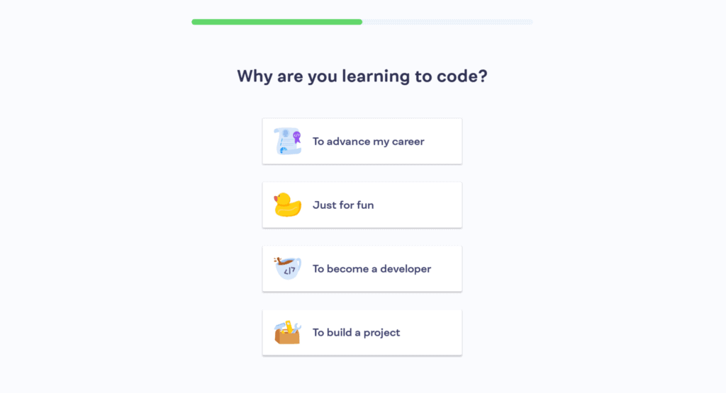
After that’s selected, you’ll be asked to enter how much coding experience you currently have.
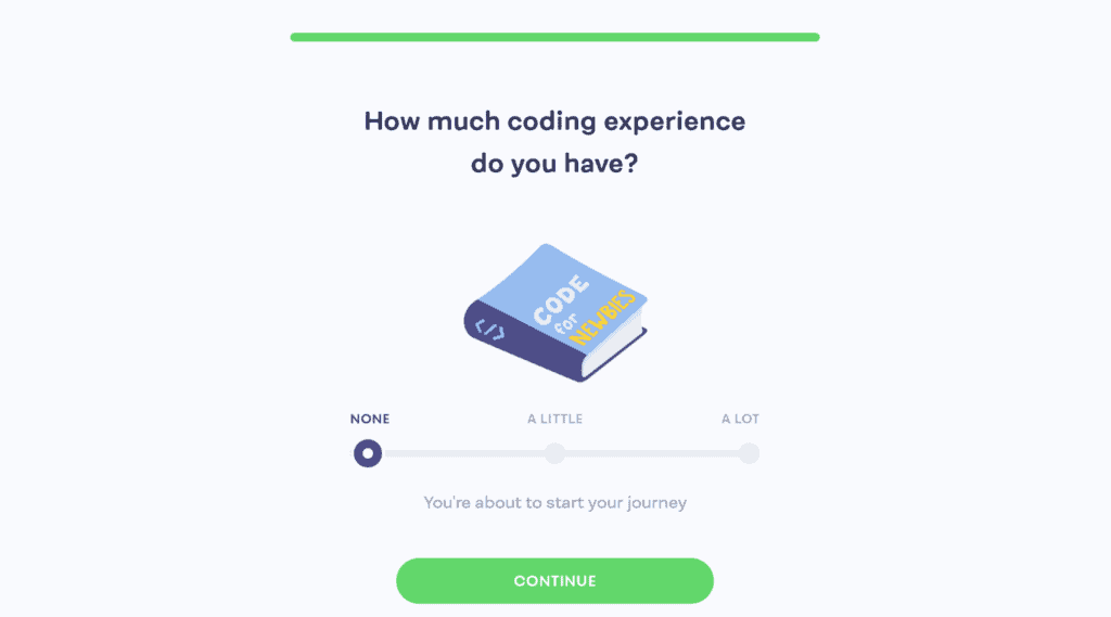
For this review, I’ve gone ahead and selected “to be a developer” alongside the “none” option for my coding experience.
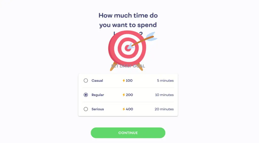
Other things that you would need to setup are your reminders as well as how much you wish to spend each day coding.
1) Mimo’s Interface
Mimo hands-down takes the cake for having the best layout/design. One look at its design and I can say that it is certainly the best in the list.
The home page is divided into the following sections:
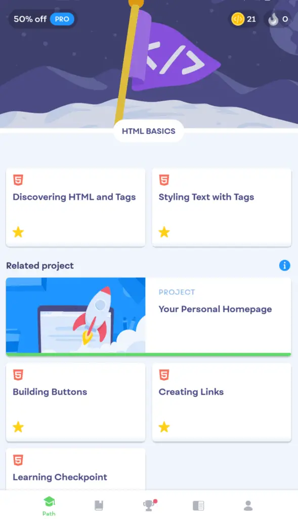
- Path – This is where your courses are broken down into, and it acts as your homepage as well.
- Browse – Here you can find your next challenge, next project, recommended courses, as well as browse categories.
- Weekly leaderboard – Here you can find your current standings, view your opponents, and see your current league.
- Glossary – This is a Pro version exclusive, perfect for finding quick definitions and examples of certain elements, and tags.
- Profile – This isn’t of much use, it essentially gives you access to your profile, bio, current level, and playgrounds, which allows you to make a new playground where you can code anything you desire using the skills you’ve learned.

Here is an in-depth review of what I think of each section & what are their main purposes:
1.1) Mimo’s Homepage (Path Tab)
The path option is essentially the homepage where your current courses are broken down to make it easier to view your current topics. I assume that when purchasing the Pro version, and when enrolling in more courses, the path tab will expand.
Upon entering the path tab, you’ll be immediately greeted with a stunningly simple, yet effective layout. In order to progress on to other topics, you’ll be required to complete the ones above, I’m guessing that if you previously entered in that you have some or a lot of experience coding before signing up, then you’ll be able to skip most of the topics.
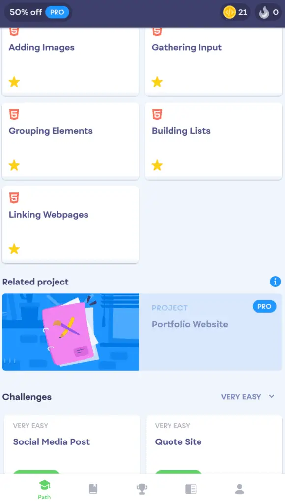
But if you’re like most of us, and just starting out, the Mimo app ensures that you go from HTML to CSS and then to JavaScript by unlocking each topic as you go. This is an effective way of learning, as you’ll need to understand the basics of HTML before being able to effectively use CSS. And once you’ve learned both HTML & CSS, learning JavaScript will be much easier and more understandable.
The “path” tab can be easily navigated; all your topics are nicely broken down and the subheadings of each topic makes it clear what you’ll be learning.
Each block of a topic is grouped into their own subheading. For HTML, there are two subheadings which are HTML Basic and HTML intermediate as shown in the screenshot below.
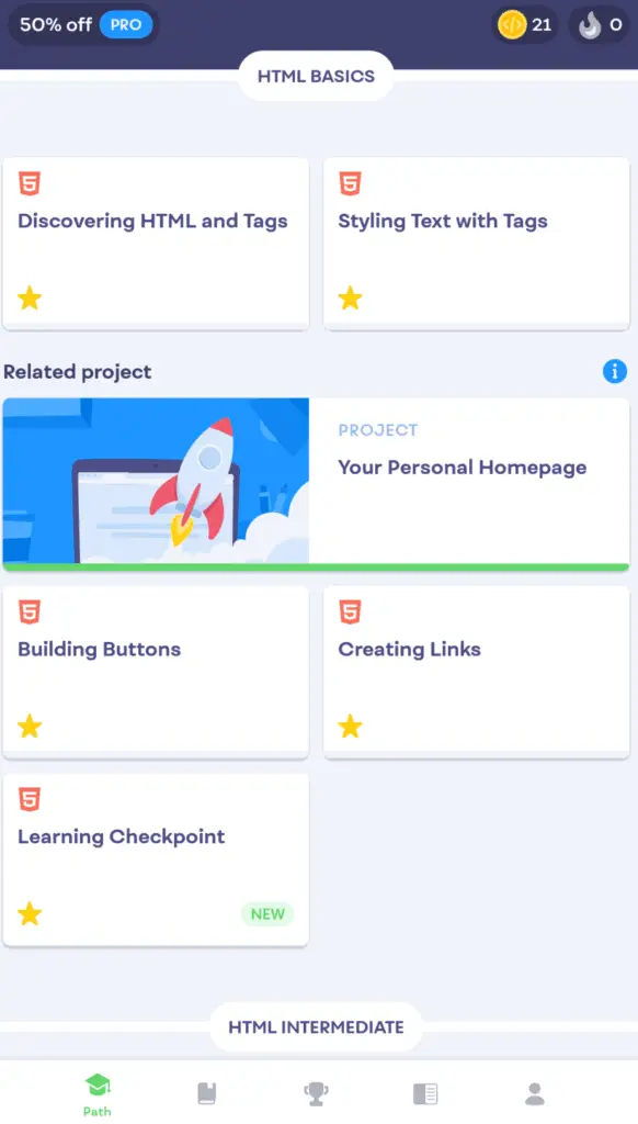
There are also related projects, as well as challenges which you can utilize to put your skills to test. Challenges are my favorite as they give you more freedom as to how you approach problems, and the rating system makes it clear as to what your mistakes were.
While projects are meant to showcase your skills and you can essentially freely code the project while receiving little guidance from the Mimo app.
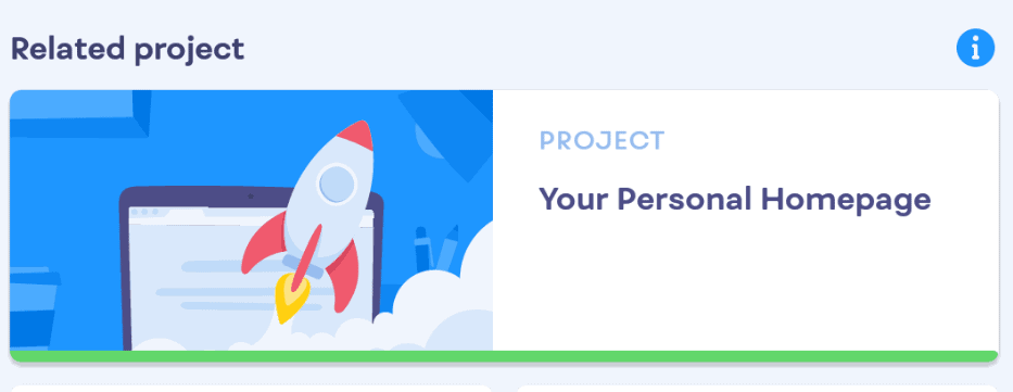
Keep in mind that projects typically are locked behind paywalls, which cost $8.99/Month or $4.99/Month if you renew yearly, more on the premium benefits and features later on.
If you do get a challenge wrong, you can easily view what went wrong, or click “see the solution” if you can’t figure it out, which is something that is highly discouraged, as you won’t earn any XP when doing that.
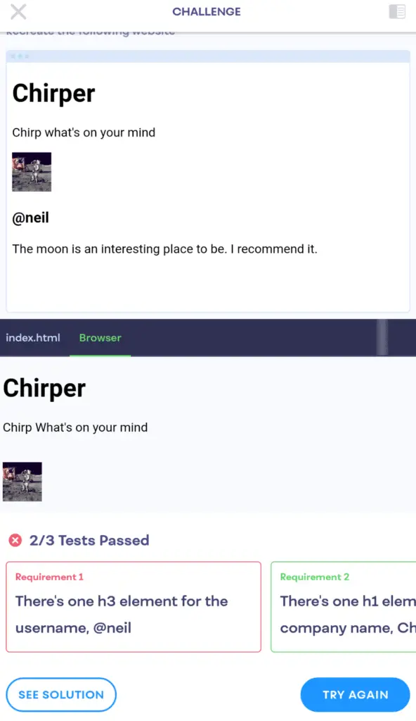
Challenges can be found at the end of each course, and don’t require you to complete all the topics to take part in them, in other words, you can do the challenges at any time.
Challenges are split into categories of:
- Very Easy
- Easy
- Medium
- Hard
- Very Hard
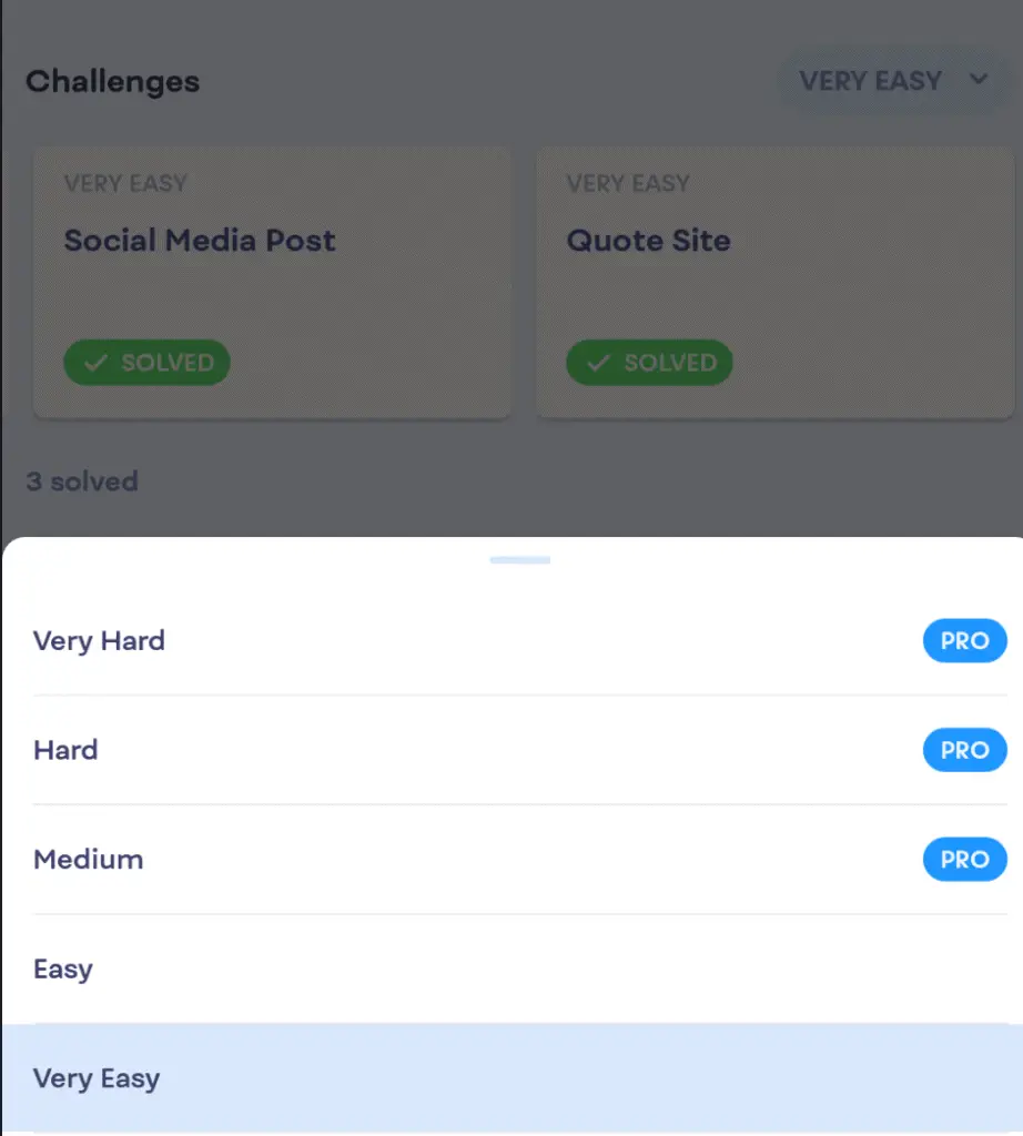
Take note that for the medium, hard, and very hard challenges, you’ll be required to have the Pro version of Mimo. But challenges make the learning experience more interesting, and the satisfaction of overcoming a difficult challenge will definately make you want to continue, and for that feature alone, I say it’s worth splurging for the Pro version.
1.2) Mimo’s Other Interfaces
After the path tab, is the browse tab. Unfortunately, if you don’t have the Pro version, this section is basically useless to you, unless you just want to see your next challenge/project, as the rest of the features under this section are locked for pro users only.
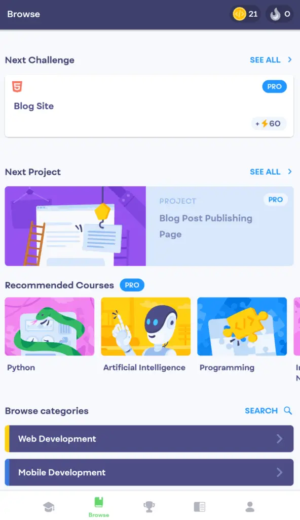
Under the browse tab, you can also find your recommended courses. Every user has different courses recommended to them, but if you want to look for a specific course, you could click the search icon beside the browse categories subheading.
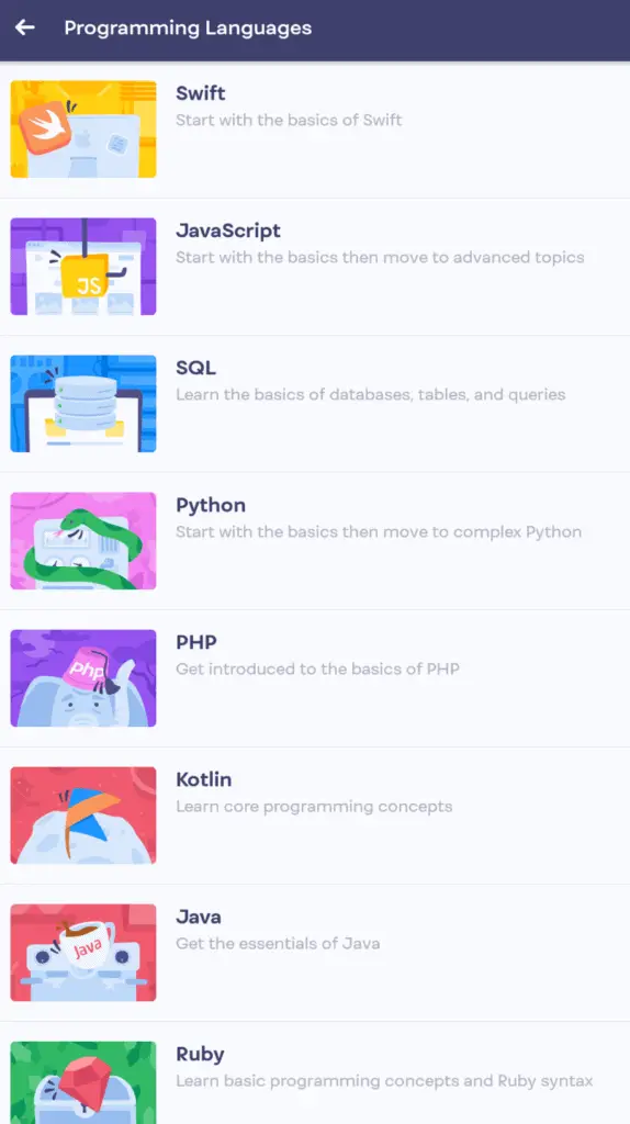
You could also browse through all the categories to find a new course to enroll in, which are:
- Web Development
- Programming Languages
- Digital Literacy
- Cybersecurity
- Mobile Development
- Data Science
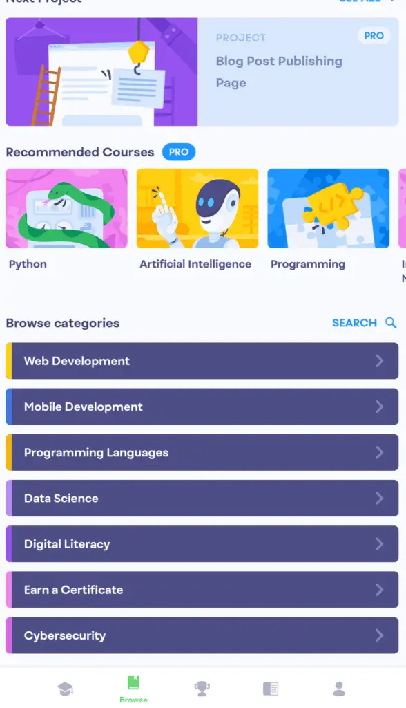
Under each category are different courses, where you can further enlighten yourself with new programming languages or subjects. There is a big selection of courses within each of these categories but they are only for the Pro version.
After that, it is the leaderboard tab. The leaderboard tab resets every week. In order to progress onto the next league, you’ll have to rank the top ten in your current league for the week. There is a total of 5 leagues, and all users start at the Wooden League.
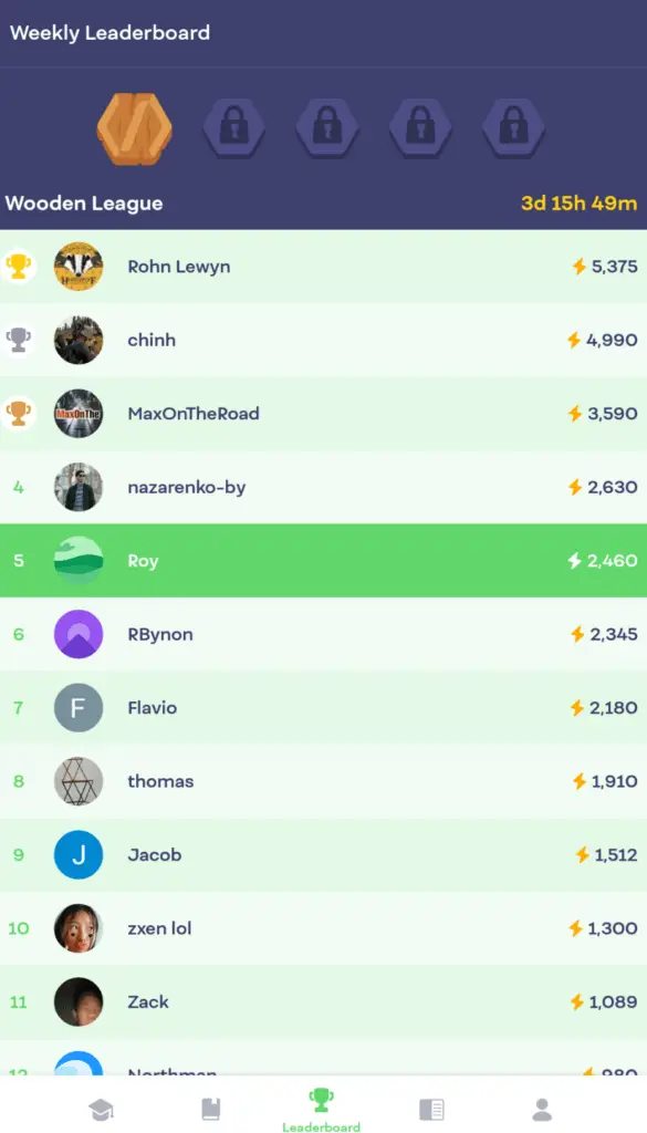
This gives an opportunity to all users, to have a chance on the leaderboard, while motivating them to keep up with their daily coding schedule, as only if you maintain it for a week, will you be able to go onto the next league.
Getting the rank of #1, especially at the Wooden League stage, isn’t too difficult, but maintaining it is the real challenge.
Up next is the glossary, which is one of my favorite features the Mimo app has to offer.
The glossary is the go-to place to find definitions, quick revisions, and examples of elements, and tags.
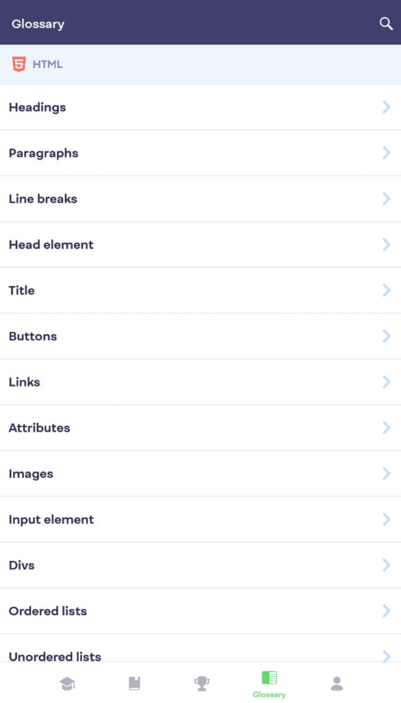
My glossary contains explanations for HTML, CSS, and JavaScript, but I’m unsure if the glossary will expand if you take up more courses on the app.
You do have to pay for Pro in order to utilize the glossary, but on the Mimo website, the glossary for HTML, CSS, JavaScript, and Python can be used for free.
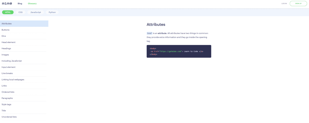
The glossary can be used for just about everyone; even if you aren’t using the app for learning to code, purchasing Pro for the glossary itself makes it worth it. Even for professionals, having a quick glossary to locate a specific explanation, is much easier than having to search it up on Google and having confusing explanations given to you.
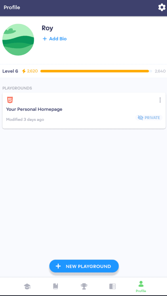
Lastly, there is the profile tab, there’s really not much to say about it; simply put, it is a place to edit your profile for the leaderboard, but you’ll mostly utilize it for the playground feature.
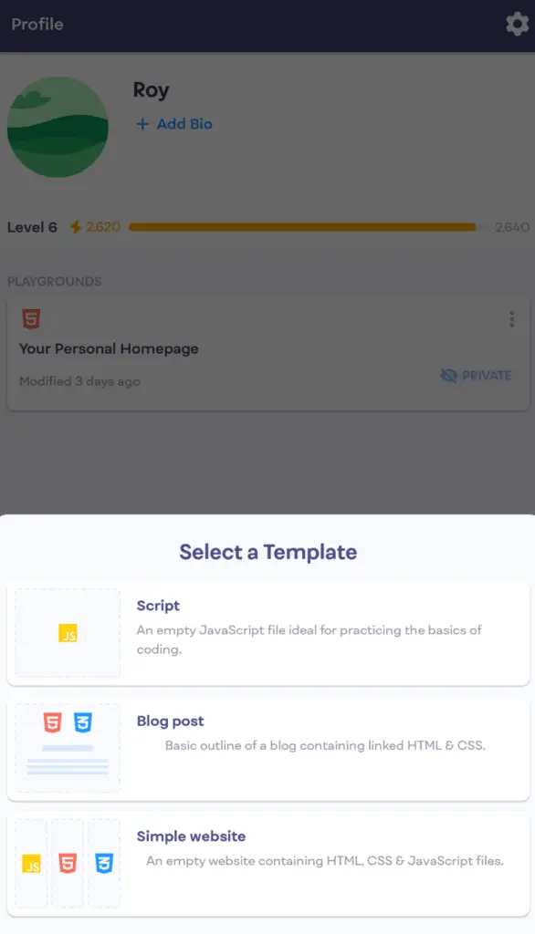
The playground option is a little different from others, as it gives you three options for templates ranging from:
- Script (JavaScript)
- Blog Post (HTML & CSS)
- Simple Website (HTML, CSS & JavaScript)
(I am unsure if this will change according to the courses you’re enrolled in, as I don’t have the Pro version, and I’m only limited to the HTML, CSS, and JavaScript courses)
Once again, it is unfortunate that this feature is locked behind a paywall, meaning to say, you’ll have to pay for the Pro subscription to access the coding playground.
If you’re looking for a free coding playground, there are a few online sites to do so on.
And if you want an app to do so, but at the same time want to use Mimo to learn to code, I recommend you just use SoloLearn’s free coding playground (SoloLearn is a “learning to code” app, similar to Mimo, my full review for SoloLearn can be found here) and jump back to Mimo to continue your learning of code.
1.3) Mimo’s Course Interface
The course interface is equally simple and minimalistic as the homepage. After selecting one of the topics from the block selection in the path menu, there is a green timeline to showcase how far you are into completing that specific topic.
Each topic course typically starts first with an explanation of what is the purpose of learning that specific topic, which I find especially useful when trying to recreate projects later on.
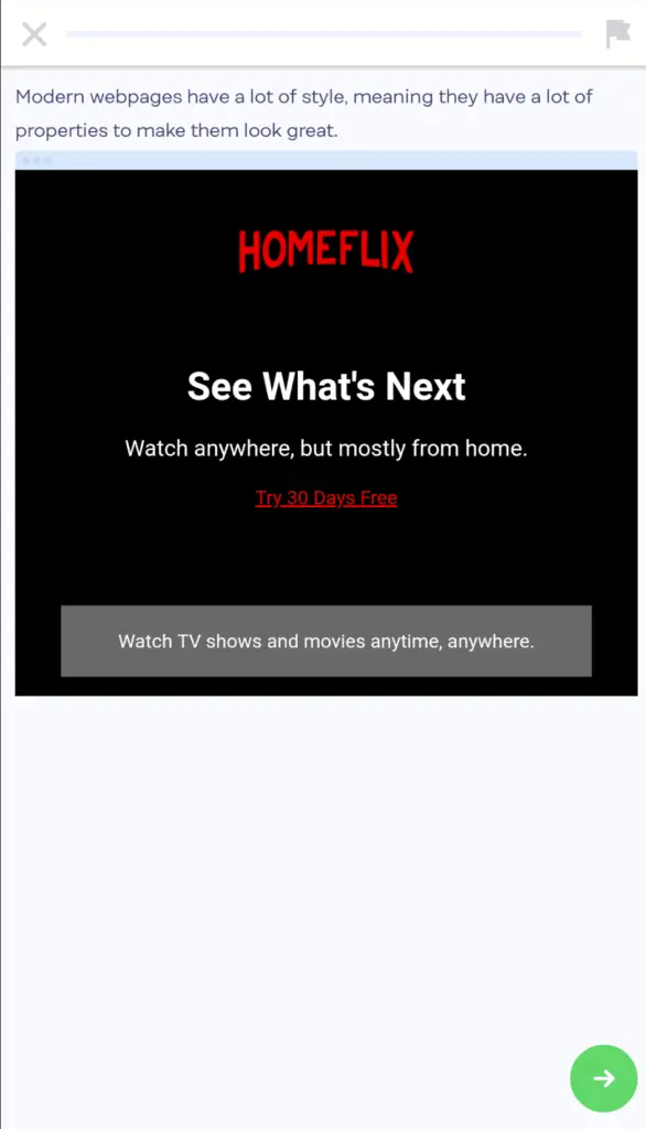
After that, it is followed up by a question. Questions are usually structured by asking you to type something in, dragging & dropping an element, switching the placements, or by clicking on the right answer.
It is also nice to see that when you’ve completed the task, you can view the outcome as well, to see how it would work out in a real-world application.
Another feature of Mimo that I adore is the correct answer streak. For instance, if you get a 5-in-a-row score, the timeline will display a “5 in a row!” to excite and persuade you to keep up with your scorestreak.

When you get 6 in a row, the timeline turns yellow, and when you achieve 8 in a row, the timeline turns red, which I find to be certainly appealing when feeling unmotivated or bored of a subject/topic.


At the end of every topic, you’ll be greeted with a lesson complete screen, showing your daily streak, correct answers count, multiplier, and how many XP you’ve earned, as well as how many more are required for that day to meet your daily goal.

(The XP system on Mimo is used for leveling up, as well as to rank on the leaderboard, but besides that, don’t provide much value.)
All-in-all the course interface is attractively simple and motivating for beginners but does come with the caveat being that is it overly hand-holding, which I’ll discuss later on, under the learning experience subheading.
2) My Learning Experience With Mimo
This is where I feel like Mimo can improve just a little more. The questions inside each topic feel like they are holding your hand rather than letting you try it out yourself.
Although the questions progressively get harder over time as you get used to the programming language, it makes it more difficult and confusing when I’m trying to replicate what I’ve learned when doing the Mimo projects, because I’m so used to dragging & dropping an element or typing in what was asked.
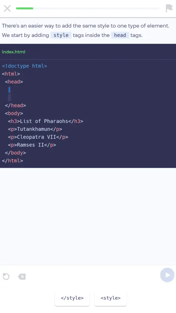
But I still agree that the Mimo style of learning is great for beginners, especially if you need more time to understand a specific topic, or if you’re the kind of person that rather practice more to be prepared for harder challenges.
Something I found is that the questions are specifically laid out to tackle the topic in every possible way.
For example, when learning a topic of headings, I would first be presented with what headings are, and how they can be used, followed by having to click on the elements and to place them correctly, and lastly to type out the entire line of code for doing a heading.
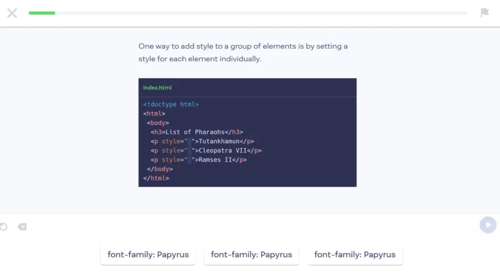
I do like this method of teaching as it slowly builds up a strong foundation of how to properly use elements and tags, but at the same time I rather it be less “hand-holding”, in the sense that there should be more questions where I can actually put the skills to use, and type out the needed code, without there being a paragraph above telling me what I should type.
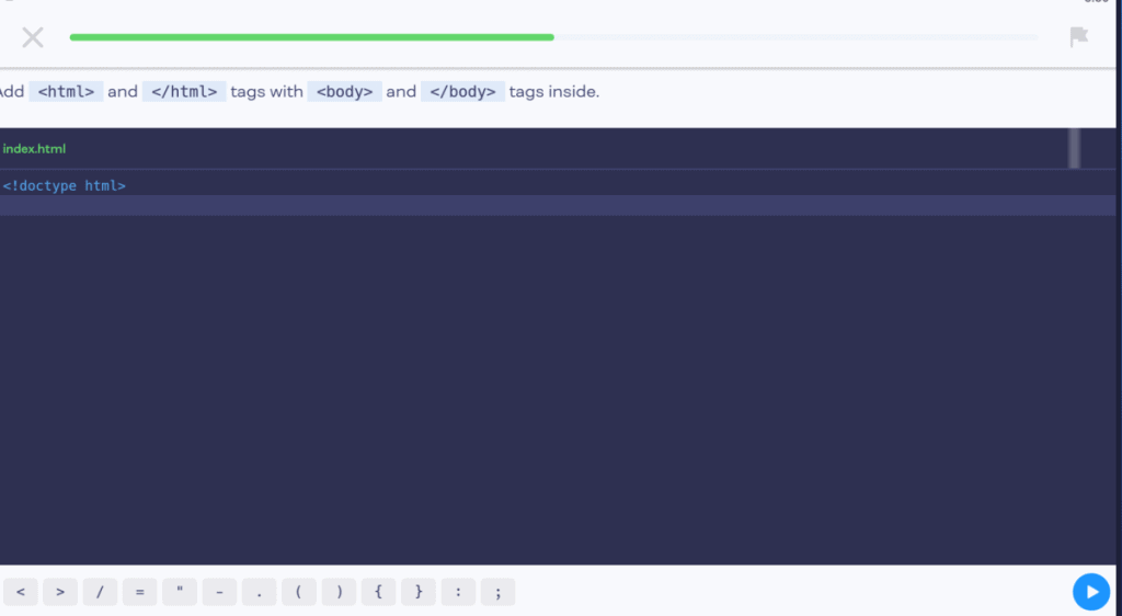
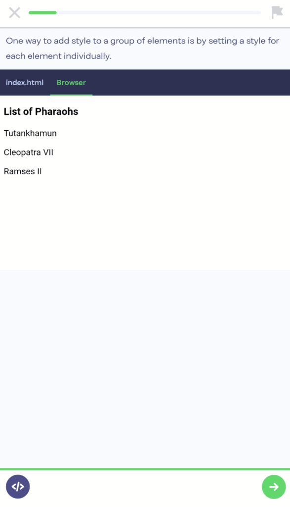
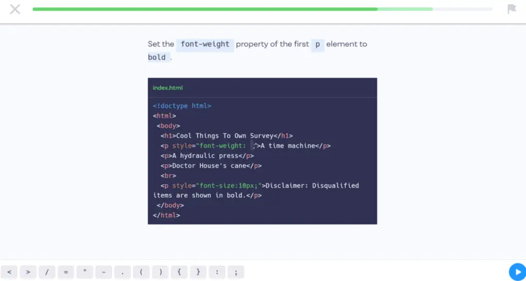
As an example, in the screenshot below, I think the question should instead tell me to bold the sentence, instead of telling me to set the font-weight property, as it would force me to think further into what I previously learned, instead of already knowing what the property is.
Another issue I ran into, is that upon finishing a topic and wanting to go back to revise it, I am met with a prompt to purchase Mimo Pro stating that I need Mimo pro to practice more challenging exercises.
As I don’t have the Pro version, I’m guessing that each topic has more advanced exercises that can only be accessed with Mimo Pro, and I’m not even sure if there is a feature to revisit a previous topic.
But, this can be easily solved by utilizing the Mimo’s glossary, considering it seems to have the explanations for all the topics taught.
3) Mimo’s Premium Subscription
The price for the Mimo Pro version are as follows:
- $8.99/Month
- $59.99/For First Year – $4.99/Month (billed yearly) – Free 7-day trial available
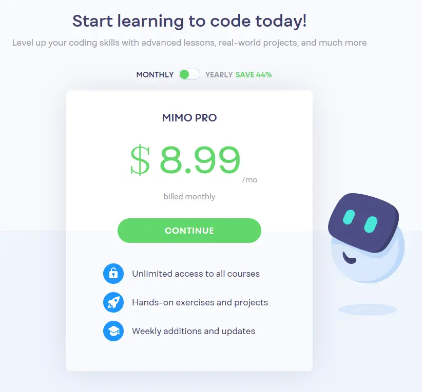
The Mimo Pro service offers the following features:
- Unlimited Access To All Courses
- Hands-On Exercises And Projects
- Weekly Additions And Updates
The main reason I would see users wanting to buy Mimo Pro is for the additional courses, there are certainly many other courses that can only be accessed through Mimo Pro, and the free version can only get you so far.
The Mimo app has a strong emphasis on getting you to buy the premium membership, which I don’t blame them for.
But you should keep it in mind before you utilize it on the daily, because you wouldn’t want to go too deep in, only to realize that for advanced projects you would have to folk out the monthly subscription price, as most consumers of these learning apps typically don’t have extra to spend.
What I Liked & Disliked When Using Mimo
What I Liked
- Best overall design; the design is clean, uncluttered, and easy to navigate
- Questions go from easy to hard; building a strong foundation
- Motivation is what the Mimo is best at. From being able to set daily reminders to having your own schedule of different courses, as well as a daily streak, and scorestreak when doing each topic, this makes for the most encouraging coding app I’ve seen to date.
What I Disliked
- Too much hand-holding in questions – The questions are overly repeated, and instead, should be more focused on letting the user type the answers out, and figure the answer out themselves, instead of telling the user what to do.
- The majority of projects & challenges, as well as courses, are only available in the Pro version – which is a major disadvantage for many students, but if you’re someone with extra income and don’t mind spending extra for the better design of the Mimo app, then it is perfect for you.
Mimo Review Summary
All-in-all the Mimo app has an extensive feature set, but in order to continue using the app you will have to purchase the Pro version, I recommend you test it out, and if you like it, purchase the Pro version from the start so you can utilize the Pro-only challenges and projects for all courses.
Out of all the learning-to-code apps, I still think Mimo is overall the best, (if you’re willing to pay for the monthly subscription) mainly due to its premium feel, as well as motivational factors such as leaderboards, and daily streaks.
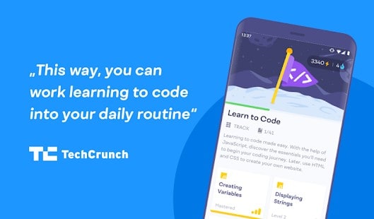
The app is perfect for quick learning sessions on the go when you have a couple of minutes to spare.
Especially if you purchase the Pro version, you’ll get access to more than just web development, and programming languages, such as data science, and cybersecurity.
And if I do decide to purchase the Pro version and learn the other programming languages Mimo has on offer, I will definitely update this review.
Mimo Alternatives
1) SoloLearn
SoloLearn is a free coding app, with many free courses which is one of it’s main highlights. It also has an active community willing to help you out, and is definately one of the best as well. You can check out my SoloLearn Review Here!
1) Programming Hub
Programming Hub also has a minimalistic design, similar to Mimo, and also has a good variety of courses in store. I highly recommend you check out my review for Programming Hub Here.
Links For Mimo
Recent Posts
If you are currently using a phone that was released a few years ago, you might be wondering if it is still being supported by the manufacturer, and receiving the necessary updates to keep up with...
1080p, otherwise known as 1920x1080, or Full HD, has long been the norm. Whether you're subscribing to a streaming service or buying a new monitor, the most common resolution is 1080p, but is 1080p...

